How effective is the combination of your main product and ancillary texts?
Our coursework is based around the brief to create a music video and 2 ancillary tasks to promote the video and artist. We chose to design a magazine advertisement and a digipak for the Artist we represented in our main task; the video. The artist is the main focus which makes it important that they are portrayed to compliment or emphasise their individual star image.
We were not just designing a paper and video based product, our idea was to create a brand for the artist and the record company that will attract fans and create a style that our target audience can relate to.
As soon as we decided on Pieces by Chase and Status and Plan B, we knew what the concept and the style had to be. As I began to research the target audience I realised that the collaboration of Plan B and Chase and Status works perfectly as they are both so different in who they appeal to. I found that what really distinguishes yet links the two artists is the fact that their fan base spans from
Both Chase and Status and Plan B are much anticipated acts at festivals all over England, Plan B is the only popular British rapper who creates his work with his guitar, giving it a rock style and developing the appreciation of rock fans, for his music.
Listening to the lyrics of the song gave us the idea to create a narrative, using the artist as the 'story teller' as well as 'acting it out'. The slow pace in music gave us the chance to show the story whilst the fast drum and bass pace allowed us to speed up the video and express the artists emothion using the strobe lights along with the mise en scene which worked perfectly.
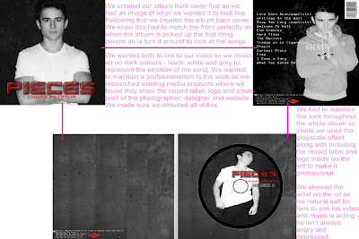
We knew we had to use the mise en scene of the artist and incorporate it in the video, advertisement and digipak. There is a continuous colour theme that runs through our tasks, of black, dark reds, white and grey, together with which makes a statement, that you can't not notice, about the style of the music without even listening to it.
It is clear to see the continuity of the imagery in the video, advert and digipak in this side by side image.
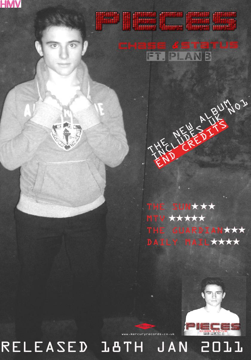
The dull, dark images of the artist in our ancillary tasks represents his lack of happiness in his relationship and also in life. The lack of colour also represents lack of emotion. These moods have also been shown in the video, digipak and the magazine advertisement.
The facial expression of the artist symbolises the mood of the song/video. The video portrays the emotions of anger, depression and fustration which correlates well with the fast pace music and the drum and bass. Therefore we felt in order to contain consistency between the three products it was essential that these emotions were presented in the album cover and digipak.
Throughout all of our products from our video to the inside of our album we tried to maintain a brand identity. A brand identity is to represent our artist's values, services, ideas and personality. A consistent and well-positioned brand can do our advertising, it can generate loyalty from your customers.
Wouldn't you think of brand identity as just a logo?
Maybe that's how it starts out for most companies across all different types of businesses but for us it goes way beyond being ‘just a logo'. Obviously, there can be a logo, a distinctive font and colour scheme, but it's how we choose them and pull them all together that sets us apart.
We aimed to create this brand identity for our artists through all our products. I think we have done this as a team making sure everything relates; we used our target audience for feedback.
When showcasing our final cut to our target audience we asked the audience to fill out a questionnaire. One of the questions asked 'Do you think our ancillary tasks linked to our video?".
Overall the audience stated that their was a clear brand identity between the three products.


No comments:
Post a Comment