This is the image that we decided to use for the
album cover. The front cover image needs to be eye-catching to the audience:

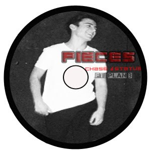
The next stage was simple as Stef had already allocated a specific font for the album name and artist's names that we all agreed on straight away. The font we decided to use for Pieces and Chase & Status was 'Clubland'. As this emphasised the genre of the music that Chase & Status produce. However to show the rap artist Plan B's genre of music we used the font 'Capture it 2'. The use of colour in the font was inspired by existing digipaks.
From research of real media products we noticed that the back cover of the album all shared the same conventions. A list of titles are all displayed on the back cover, barcode, record label logo and copywright details.
Here is our back cover to the Digipak I believe that the simplicity of the image works well as it allows room for the track names.

From research it was difficult to state which conventions each inside of the album contained as each had different. The inside sleeves I found contained: an image of the band, a list of tracks from the album, a plain colour.
However a majority contained detials about the arists record label, copywright, websites and production information.

Here we placed the CD disc cover ontop of the inside panel to see how it would look when placed inside the Digipak

No comments:
Post a Comment