Wednesday 27 April 2011

Original Photos

Here are the original photos I took of our artist to create our ancillary tasks. These images are straight off the camera before we edited them.


Wednesday 16 February 2011

Digi-Pak Final

Creating the Magazine Advert

The layout we created for the magazine advert was inspired by an original Plan B magazine advert. Conventions of the magazine adverts we decided to use were:
  • Displaying the name of the album and centralising it at the top of the page.
  • Showing an insert shot of the album cover.
  • Creating a star rating section from newspapers and magazines - the use of well-known players in the media industry to promote the album, also fitting the conventions.
  • A striking focus image.
  • Simple yet effective layout.
  • Legislation information - websites, record label logo and company.
The first stage was to edit the picture that we had chos
en for the advert. Stef decided to use a long shot of the artist:


After I took the photos Stef found this image as an extremely effective shot as she was able to use the background of the image for the magazine advert. ( Stef also edited the image in the same format as the album cover image).

We were aware that too many fonts or a mixture of fonts would create a busy layout and can draw attention away from the main intention of the advert- attracting its target audience. The same font was used in the magazine advert to create a house style. However a font was added to display the information on the advert. The font I decided to use was, 'OCR A STD'. The simple font creates the product to look more professional.

This is the final magazine advertisement which meets the conventions of a magazine advert in the real media industry:


Creating The Digi-Pak

Once the images of our artist were taken , the next stage was to choose the photos we wanted and edit in them in the software we chose Abode Photoshop. To create a house style all pictures would be edited in the same format. Stef desaturated the image and adjusted the exposure and brightness levels to create the effect that was suitable for the product. We decided that the album cover would contain a medium close up of the artist, this is an effective form of the promoting as the audience will relate to the image.

This is the image that we decided to use for the
album cover. The front cover image needs to be eye-catching to the audience:


The next stage was simple as Stef had already allocated a specific font for the album name and artist's names that we all agreed on straight away. The font we decided to use for Pieces and Chase & Status was 'Clubland'. As this emphasised the genre of the music that Chase & Status produce. However to show the rap artist Plan B's genre of music we used the font 'Capture it 2'. The use of colour in the font was inspired by existing digipaks.

From research of real media products we noticed that the back cover of the album all shared the same conventions. A list of titles are all displayed on the back cover, barcode, record label logo and copywright details.

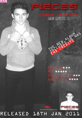
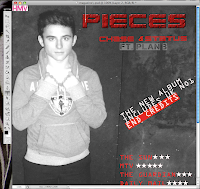
Here is our back cover to the Digipak I believe that the simplicity of the image works well as it allows room for the track names.

From research it was difficult to state which conventions each inside of the album contained as each had different. The inside sleeves I found contained: an image of the band, a list of tracks from the album, a plain colour.

However a majority contained detials about the arists record label, copywright, websites and production information.

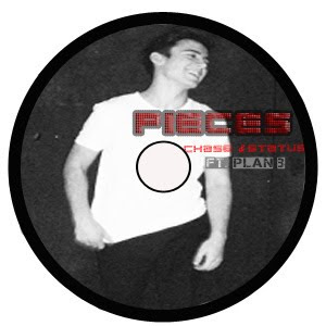
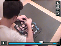
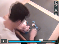
Here we placed the CD disc cover ontop of the inside panel to see how it would look when placed inside the Digipak

Creating the CD required us to ensure that there was a
clear house style. Therefore we decided to use an image of the artist and display this on the CD. We also included the house style title of the album and name of artists on the CD. Stef finished the cd by using the same effect in which she used in the magazine advertisment by using the background of the image as the CD's background.


Monday 14 February 2011

Question 4

How did you use media technologies in the construction and research, planning and evaluation stages?

Media technology has been vital in the research, planning and creating process of our A2 Media Coursework. During this time there has been a wide variety of digital technology available to us. This has been crucial in every stage of our work enabling us to create a professional looking project.

The Internet has played a key part in the research stages of our project and has provided us with existing music videos, using youtube, and digipaks helping us to understand theconventions of these products. This ensured that we were able to create a realistic and professional looking product. The internet also helped us to research our target audience, giving us an insight and in-depth knowledge of the music they like, their interests and hobbies. This allowed us to target our media products correctly. Without the use of the internet our final products would not have been so detailed and professional.


Your pictures and fotos in a slideshow on MySpace, eBay, Facebook or your website!view all pictures of this slideshow


We used a Sony DCR-HC62 camera to film our video. The high quality camera enabled us to achieve the clear picture we wanted and needed for our video to look professional. It allowed us to film Rory putting the puzzle together and then speed up this footage whilst maintaining a smooth appearance.


We also experimented with different ways of holding the camera. We used a handheld effect to create the illusion of Rory running around their house, angry, looking for Stef, which was also a point of view shot.


We also used a tripod to keep the camera steady for a clear, level shot for example when Stef and Rory are getting into the lift where we use overlays.


Once we had completed our filming we uploaded all of our footage into Final Cut using an Apple Mac computer. We imported our audio and then captured all of our footage and it was ready for us to drag edit and begin creating the final product. We dragged clips into the viewer and marked the sequence in and out to grab the part of the sequence we wanted. Our final video was coming together and using Final Cut we were able to watch the bits of video we had edited and placed in the timeline as we went along. Final Cut also enabled us to use transitions in our video to give different effects. We used a "cross dissolve”transition to give a smoother change between clips when needed, for example in places where the music slowed down. Another important effect Final Cut enabled us to achieve was the overlay. Using the different video layers we could merge images and effectively portray the idea of the puzzle piecing together, which showed that Rory was slowly finding out the truth. Using the modify toolbar in Final Cut we were also able to change the speed of our footage. For example by increasing the speed of Rory piecing together the puzzle we were able to convert a 5 minute clip into one that only lasted 3 seconds effectively.

Thanks to Facey who done a wicked job of editing the video and good skills in final cut!!


During filming, we often took my digital camera on set to take pictures for our digipack and magazine advert. The camera we used was a Panasonic LUMIX DMC-FS11 Pink Digital Camera. This is a high-resolution digital camera, which produces quality pictures and is equipped with a number of features. The use of the camera contributed to our planning stages of the digipack and magazine advert. The camera automatically detects the different lighting in which the photo is being taken and adjusts LCD brightness for optimal image viewing, which was extremely useful for the different environments in which our photos were taken for our locations.


Photoshop contributed majorly, with the construction of our digipack and magazine advert. We decided that the background of the image was a perfect back-drop creating the theme of our video. To the original image we adjusted the opacities and contrast of the images.


After adjusting the brightness slightly, we used the text tool to insert our font on a new layer. Our main font 'clubland' was chosen from dafont.com. With the use of the free transform tool, we were able to change the angle of our font to add emphasis on certain words. Photoshop is equipped with a huge variety of fonts, which gave us a huge scope of font choices for the different texts used. We would not have been able to do this in most Microsoft programmes, as they do not provide the vital fonts we wanted for our digipack.


This also contributed to planning and research, as we could ask our target audience on their views of the fonts. Photoshop also helped to display the digipack, in a 3 dimensional format on Blogger. Once the image was created I was able to save and upload them as a JPEG in Blogger.


Blogger is an interactive blog and been used for the display and planning of our products. Blogger is like an interactive folder, which contains labels, posts, links, and archives. Blogging allowed us to present all the research and construction of our work. Through Blogger, we were able to display our research of media conventions through the uploading of example music videos. This was a simple process, and simply involved copying and pasting embedding codes. With the use of programmes such as imageloop, I was able to upload slideshows onto my blog to display our work and research. Blogger, also allowed us to include hyperlinks in our work presentation, which was used as part of our research and planning. For my evaluation stages of our project, media technology has been key in presenting our work to be assessed. This has allowed us to present our work in an easy format using digital technology to our full advantage. We have also used the camera to video our target audience where we arrange it like an interview. We were then able to edit our video in final cut, including our song as a backing track and using clips of our video to support what they were saying. We also used the the big projector screen which was a useful way of showing our music video to our target audience.


Question 3

What have you learned from your audience feedback?

Our target audience first saw our video as a rough cut and gave us feedback then. We knew that we would receive some negative feedback as the video was not completed to the highest standard and we knew it needed improving. During the showing we asked the audience to write any comments on a piece of paper so that we could evaluate after the showing.

Points needed for improvement

The editing does not match the music in parts of the song
The ending needs to be more dramatic

The parts including the moving picture needs to be emphasized

Therefore we realised that we needed some additional footage so that the music correlates with the editing to make the video professional. An audience member stated that 'we should use effective lighting to convey the feeling on the fast tempo of music'. We decided that we would create a non naturalistic scene and use a strobe light to emphasise the music. The scene also included lip syncing which enforced the conventions of a music video.

Once our video was completed to its full potential we organised a meeting in our media room where we could show our music video on a big screen. We created questionnaires for them to answer and as soon as the video was shown we received loads of feedback from friends and fellow students impressed with our work.


These people were also mainly our target audience as they were mostly our age with similiar interests and definiately a passion for this music genre. Our most popular piece of feedback was how intense the video is showing how the narrative really grabs them to want to watch more.

We also filmed our target audience giving us feedback to questions we asked. We added our song as a backing track. We also used sections of the music video in the evaluation to use as evidence once the comment has been made.

Here is some further feedback that we acheived in an interview format, producing a feedback video:

Click here for our group video on our audience feedback!

Question 2

How effective is the combination of your main product and ancillary texts?

Our coursework is based around the brief to create a music video and 2 ancillary tasks to promote the video and artist. We chose to design a magazine advertisement and a digipak for the Artist we represented in our main task; the video. The artist is the main focus which makes it important that they are portrayed to compliment or emphasise their individual star image.


We were not just designing a paper and video based product, our idea was to create a brand for the artist and the record company that will attract fans and create a style that our target audience can relate to.

As soon as we decided on Pieces by Chase and Status and Plan B, we knew what the concept and the style had to be. As I began to research the target audience I realised that the collaboration of Plan B and Chase and Status works perfectly as they are both so different in who they appeal to. I found that what really distinguishes yet links the two artists is the fact that their fan base spans from


Both Chase and Status and Plan B are much anticipated acts at festivals all over England, Plan B is the only popular British rapper who creates his work with his guitar, giving it a rock style and developing the appreciation of rock fans, for his music.


Listening to the lyrics of the song gave us the idea to create a narrative, using the artist as the 'story teller' as well as 'acting it out'. The slow pace in music gave us the chance to show the story whilst the fast drum and bass pace allowed us to speed up the video and express the artists emothion using the strobe lights along with the mise en scene which worked perfectly.

We knew we had to use the mise en scene of the artist and incorporate it in the video, advertisement and digipak. There is a continuous colour theme that runs through our tasks, of black, dark reds, white and grey, together with which makes a statement, that you can't not notice, about the style of the music without even listening to it.

It is clear to see the continuity of the imagery in the video, advert and digipak in this side by side image.


The dull, dark images of the artist in our ancillary tasks represents his lack of happiness in his relationship and also in life. The lack of colour also represents lack of emotion. These moods have also been shown in the video, digipak and the magazine advertisement.

The facial expression of the artist symbolises the mood of the song/video. The video portrays the emotions of anger, depression and fustration which correlates well with the fast pace music and the drum and bass. Therefore we felt in order to contain consistency between the three products it was essential that these emotions were presented in the album cover and digipak.


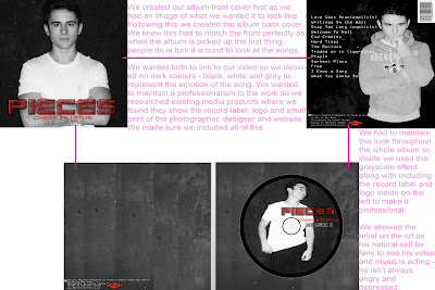
Throughout all of our products from our video to the inside of our album we tried to maintain a brand identity. A brand identity is to represent our artist's values, services, ideas and personality. A consistent and well-positioned brand can do our advertising, it can generate loyalty from your customers.


Wouldn't you think of brand identity as just a logo?


Maybe that's how it starts out for most companies across all different types of businesses but for us it goes way beyond being ‘just a logo'. Obviously, there can be a logo, a distinctive font and colour scheme, but it's how we choose them and pull them all together that sets us apart.

We aimed to create this brand identity for our artists through all our products. I think we have done this as a team making sure everything relates; we used our target audience for feedback.


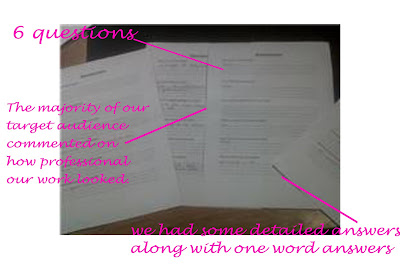
When showcasing our final cut to our target audience we asked the audience to fill out a questionnaire. One of the questions asked 'Do you think our ancillary tasks linked to our video?".


Overall the audience stated that their was a clear brand identity between the three products.


Question 1

In what ways does your media product use, develop or challenge forms and conventions of real media products?

After our video was finally completed we uploaded it to our blog and gathered everyone in our media room to watch it. As far as we could see they were all enjoying it and they all commented on how professional it looked.


When researching we looked through music videos to look at the forms and conventions of music videos today to help with ideas and find key features we need to include. When researching as a group we looked through the statements made by Andrew Goodwin's theory of music videos. His statements pointed us in the right direction of what to include.


Andrew Goodwin

Relation between the visuals and the song - thought beats, seeing the sound. Close ups are essential. Music videos create and enhance star image. Technical aspects.


The conventions that we used in our video are;

Technical aspects
Star image
A narrative performance

In conclusion I think music videos would not have the power to attract without:


Lip syncing/ close ups/ accurate editing/ camera movements that enhance the music/ a clear interpretation and amplification of the lyrics/ iconographic mise en scene.


How have we achieved this??


I am going to look at some of my favourite shots from the video and analyse how we encorporated these conventions into our final product!

Correlation between lyrics and visuals
As you can see from the printscreens below, we aimed to correlate our video with the name of the song, 'Pieces'. Throughout our video we based it around the idea of 'pieces' of a puzzle, where our main character would find the pieces and put together a puzzle which he solves to discover his lover is cheating with another man, his bestfriend.

When we created our storyboard for the music video, we considered what the lyrics meant as a group before deciding what the music video was even going to be about. Therefore, it was important for us to emphasise the name of the song in the video.


Editing

In this particular part of the music video we have desaturated the shots because the shot is meant to show an activity of the past. The shot shows a photo which by changing the shot to be in black and white it makes it seem dated. We also added a flash and changed our moving film into a still image.


Throughout the video we ensured that the audience are 'hearing what they're seeing'. Therefore we made the editing of the video show this. The song 'Pieces' has changes of pace throughout which meant the pace of the editing changed dramtically throughout. The begining of the song presents a slow place, therefore the use of dissolve transistions such as cross disolves empasised the slow editing. The cross dissolves when the song commences suggests the shot is a flashback.


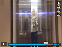
However the postion and body language of the characters indicates that his memory only allows him to remember the less happier times of their relationship. The quick short cuts created a intense situation, this is also emphasised by the use of the strobe light.


Star image and close ups

Throughout the video we aimed to make the camera privilege the artist by the amount of screen time he has. Although our narrative story is told throughout, the camera emphasises the main artist, this is demonstrated by lip syncing.


Desaturation of our opening shot at the beginning of the scene emphasies the mood of the artist, creating a dull atmosphere. The lighting was a techincal aspect to our music video; the use of the strobe light, linked with the pace of the music, creating a frantic atmosphere.


Plan B

Benjamin Paul Ballance-Drew (born 22 October 1983), primarily known as Plan B or Ben Drew, is a British rapper, singer-songwriter, actor and film director from Forest Gate, London. Plan B first emerged as a hip hop artist releasing his critically-acclaimed début album Who Needs Actions When You Got Words in 2006. His second studio album The Defamation of Strickland Banks (2010) was a soul record and went straight into the UK album chart at #1. He has also collaborated with other artists such as Chase & Status most notably on the top ten single "End Credits" (2009). Drew has also had a successful film career as an actor, with roles in Adulthood (2008), Harry Brown (2009) and 4.3.2.1 (2010). In 2011, he will release Ill Manors his first film as a director.


Genre:

Hip Hop: an urban youth culture associated with rap music and the fashions of African-American residents of the inner city.

Grime: is a genre of urban music which first emerged in Bow, East London, England in the early 2000s, primarily a development of UK garage, dancehall, and hip hop.
Acoustic: Acoustic music comprises music that solely or primarily uses instruments which produce sound through entirely acoustic means, as opposed to electric or electronic means.

Soul: a music genre originating in the United States combining elements of gospel music and rhythm and blues.

Plan B believes that the public are wary of approaching him after viewing his violent film roles. Speaking to FHM about his villainous part in 2009 British crime drama Harry Brown, the 'Prayin' singer said: "It's my job to make the audience hate me. And it's much easier to make people hate you than like you." He added that critical reaction to his first album, 2006's Who Needs Actions When You Got Words, had contributed to this perception.

"People find me unapproachable and are intimidated by what's written about me. It's just playing on that, it's f**king easy for me."
However, the rapper also believes that the mainstream success of his second album, the platinum-selling The Defamation Of Strickland Banks, has helped soften his image by appealing to numerous demographics.

"I've had grannies and all sorts coming up to me," he revealed. "What's great about the new album is it's old music that dads and grans and s**t can be into, but also kids and teenagers because it's got rapping in it."

Plan B recently stated that he wasn't interested in becoming a role model or acting responsibly for the sake of his fans.

Chase and Status

Chase & Status are an electronic production duo from London consisting of Saul "Chase" Milton and Will "Status" Kennard.


Chase & Status have had three number one tracks on the UK Dance Chart in 2007 with the double A-side "Hurt You"/"Sell Me Your Soul", and in 2008 with "Take Me Away"/"Judgement (Informer)". On 5 October 2008, they reached number 70 on the national singles chart and number one on the UK Dance Chart again with their single "Pieces" featuring vocals by Plan B.

In 2009, they made number 45 with "Against All Odds" which featured UK rapper Kano.
Chase & Status' first album, More Than Alot, debuted in the UK album charts at number 49 on 19 October 2008 and entered the UK dance album chart at number 2.
Their album More Than Alot received the Best Album Award at the 2009 Drum and Bass awards, Birmingham, UK.

Following the success of their last album the band wanted to gain a more global success. After meeting with a long time favourite of theirs, Cloud9, they decided to move in a different direction. Together they agreed that the band should do more pop collaborations in order to achieve a more mainstream fanbase. Soon afterwards they quickly began working on the album. On 8 November 2009, the duo entered the UK Top 40 for the first time with the track "End Credits". The track was released on 2 November 2009 and featuring British musician Plan B managed to reach a peak of number 9 on the UK Singles Chart. The single was written for the movie Harry Brown, which also starred Ben Drew, aka. Plan B.

Genres:

Drum and Base: is a type of electronic dance music which emerged in the mid 1990s. The genre is characterized by fast breakbeats (typically between 160–190 bpm, occasional variation is noted in older compositions), with heavy bass and sub-bass lines. Drum and bass began as an offshoot of the United Kingdom rave scene of the very early 1990s. Over the first decade of its existence, the incorporation of elements from various musical genres led to many permutations in its overall style.

Breakbeat (sometimes breakbeats or breaks): is a term used to describe a collection of sub-genres of electronic music, usually characterized by the use of a non-straightened 4/4 drum pattern (as opposed to the steady beat of house). These rhythms may be characterised by their intensive use of syncopation and polyrhythms.

Dubstep: is a genre of electronic dance music that originated in South East London. Its overall sound has been described as "tightly coiled productions with overwhelming bass lines and reverberant drum patterns, clipped samples, and occasional vocals".

Liquid funk (alternatively, Liquid Drum & Bass or Liquid): is a sub-genre of drum and bass. While it uses similar basslines and bar layouts to other styles, it contains fewer bar-oriented samples and more instrumental layers (both synthesized and natural), harmonies, and ambience, producing a calmer atmosphere directed at both home listeners and nightclub audiences.

Magazine Adverts

CD Back

CD

This is our final inside left cover of the CD. We decided to keep the backing of each part of the cd the same to create a house style. After researching the inside of cd covers I found that most contained either images of the artist or information of the record label. We decided to go for showing the record label as it looks professional and does not make the cd to overcrowded with images.


We used the same background for the inside right cover as well as the left cover so that the background appears continuous to the user, giving it a professional look.

CD front

Fonts

We looked at a number of different fonts all having our own opinion but we decided that the bottom font suits our genre and music video the best.