Wednesday, 27 April 2011
Original Photos
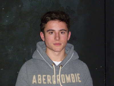
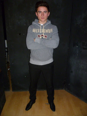
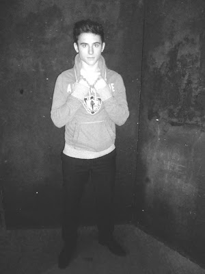
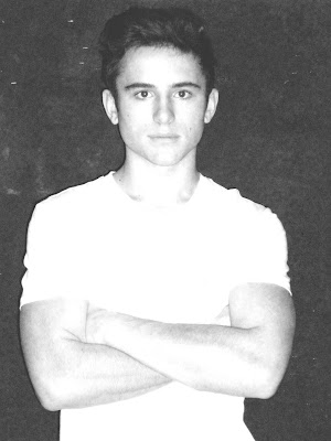
Here are the original photos I took of our artist to create our ancillary tasks. These images are straight off the camera before we edited them.
Saturday, 26 February 2011
Wednesday, 16 February 2011
Creating the Magazine Advert
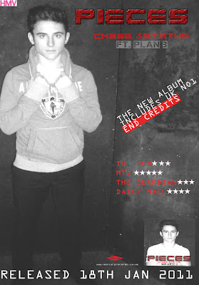
The layout we created for the magazine advert was inspired by an original Plan B magazine advert. Conventions of the magazine adverts we decided to use were:
- Displaying the name of the album and centralising it at the top of the page.
- Showing an insert shot of the album cover.
- Creating a star rating section from newspapers and magazines - the use of well-known players in the media industry to promote the album, also fitting the conventions.
- A striking focus image.
- Simple yet effective layout.
- Legislation information - websites, record label logo and company.
The first stage was to edit the picture that we had chos
en for the advert. Stef decided to use a long shot of the artist:
After I took the photos Stef found this image as an extremely effective shot as she was able to use the background of the image for the magazine advert. ( Stef also edited the image in the same format as the album cover image).
We were aware that too many fonts or a mixture of fonts would create a busy layout and can draw attention away from the main intention of the advert- attracting its target audience. The same font was used in the magazine advert to create a house style. However a font was added to display the information on the advert. The font I decided to use was, 'OCR A STD'. The simple font creates the product to look more professional.
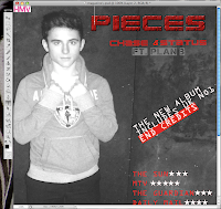
This is the final magazine advertisement which meets the conventions of a magazine advert in the real media industry:
Creating The Digi-Pak
Once the images of our artist were taken , the next stage was to choose the photos we wanted and edit in them in the software we chose Abode Photoshop. To create a house style all pictures would be edited in the same format. Stef desaturated the image and adjusted the exposure and brightness levels to create the effect that was suitable for the product. We decided that the album cover would contain a medium close up of the artist, this is an effective form of the promoting as the audience will relate to the image.
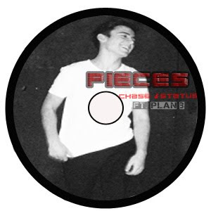
Creating the CD required us to ensure that there was a clear house style. Therefore we decided to use an image of the artist and display this on the CD. We also included the house style title of the album and name of artists on the CD. Stef finished the cd by using the same effect in which she used in the magazine advertisment by using the background of the image as the CD's background.
This is the image that we decided to use for the
album cover. The front cover image needs to be eye-catching to the audience:
The next stage was simple as Stef had already allocated a specific font for the album name and artist's names that we all agreed on straight away. The font we decided to use for Pieces and Chase & Status was 'Clubland'. As this emphasised the genre of the music that Chase & Status produce. However to show the rap artist Plan B's genre of music we used the font 'Capture it 2'. The use of colour in the font was inspired by existing digipaks.
From research of real media products we noticed that the back cover of the album all shared the same conventions. A list of titles are all displayed on the back cover, barcode, record label logo and copywright details.
Here is our back cover to the Digipak I believe that the simplicity of the image works well as it allows room for the track names.
From research it was difficult to state which conventions each inside of the album contained as each had different. The inside sleeves I found contained: an image of the band, a list of tracks from the album, a plain colour.
However a majority contained detials about the arists record label, copywright, websites and production information.
Here we placed the CD disc cover ontop of the inside panel to see how it would look when placed inside the Digipak
Monday, 14 February 2011
Question 4
How did you use media technologies in the construction and research, planning and evaluation stages?
Media technology has been vital in the research, planning and creating process of our A2 Media Coursework. During this time there has been a wide variety of digital technology available to us. This has been crucial in every stage of our work enabling us to create a professional looking project.
The Internet has played a key part in the research stages of our project and has provided us with existing music videos, using youtube, and digipaks helping us to understand theconventions of these products. This ensured that we were able to create a realistic and professional looking product. The internet also helped us to research our target audience, giving us an insight and in-depth knowledge of the music they like, their interests and hobbies. This allowed us to target our media products correctly. Without the use of the internet our final products would not have been so detailed and professional.
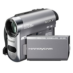
We used a Sony DCR-HC62 camera to film our video. The high quality camera enabled us to achieve the clear picture we wanted and needed for our video to look professional. It allowed us to film Rory putting the puzzle together and then speed up this footage whilst maintaining a smooth appearance.
Once we had completed our filming we uploaded all of our footage into Final Cut using an Apple Mac computer. We imported our audio and then captured all of our footage and it was ready for us to drag edit and begin creating the final product. We dragged clips into the viewer and marked the sequence in and out to grab the part of the sequence we wanted. Our final video was coming together and using Final Cut we were able to watch the bits of video we had edited and placed in the timeline as we went along. Final Cut also enabled us to use transitions in our video to give different effects. We used a "cross dissolve”transition to give a smoother change between clips when needed, for example in places where the music slowed down. Another important effect Final Cut enabled us to achieve was the overlay. Using the different video layers we could merge images and effectively portray the idea of the puzzle piecing together, which showed that Rory was slowly finding out the truth. Using the modify toolbar in Final Cut we were also able to change the speed of our footage. For example by increasing the speed of Rory piecing together the puzzle we were able to convert a 5 minute clip into one that only lasted 3 seconds effectively.
Thanks to Facey who done a wicked job of editing the video and good skills in final cut!!
During filming, we often took my digital camera on set to take pictures for our digipack and magazine advert. The camera we used was a Panasonic LUMIX DMC-FS11 Pink Digital Camera. This is a high-resolution digital camera, which produces quality pictures and is equipped with a number of features. The use of the camera contributed to our planning stages of the digipack and magazine advert. The camera automatically detects the different lighting in which the photo is being taken and adjusts LCD brightness for optimal image viewing, which was extremely useful for the different environments in which our photos were taken for our locations.
Photoshop contributed majorly, with the construction of our digipack and magazine advert. We decided that the background of the image was a perfect back-drop creating the theme of our video. To the original image we adjusted the opacities and contrast of the images.
Media technology has been vital in the research, planning and creating process of our A2 Media Coursework. During this time there has been a wide variety of digital technology available to us. This has been crucial in every stage of our work enabling us to create a professional looking project.
The Internet has played a key part in the research stages of our project and has provided us with existing music videos, using youtube, and digipaks helping us to understand theconventions of these products. This ensured that we were able to create a realistic and professional looking product. The internet also helped us to research our target audience, giving us an insight and in-depth knowledge of the music they like, their interests and hobbies. This allowed us to target our media products correctly. Without the use of the internet our final products would not have been so detailed and professional.
We used a Sony DCR-HC62 camera to film our video. The high quality camera enabled us to achieve the clear picture we wanted and needed for our video to look professional. It allowed us to film Rory putting the puzzle together and then speed up this footage whilst maintaining a smooth appearance.
We also experimented with different ways of holding the camera. We used a handheld effect to create the illusion of Rory running around their house, angry, looking for Stef, which was also a point of view shot.
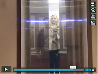
We also used a tripod to keep the camera steady for a clear, level shot for example when Stef and Rory are getting into the lift where we use overlays.
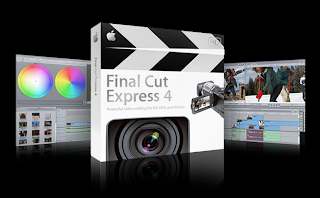
Once we had completed our filming we uploaded all of our footage into Final Cut using an Apple Mac computer. We imported our audio and then captured all of our footage and it was ready for us to drag edit and begin creating the final product. We dragged clips into the viewer and marked the sequence in and out to grab the part of the sequence we wanted. Our final video was coming together and using Final Cut we were able to watch the bits of video we had edited and placed in the timeline as we went along. Final Cut also enabled us to use transitions in our video to give different effects. We used a "cross dissolve”transition to give a smoother change between clips when needed, for example in places where the music slowed down. Another important effect Final Cut enabled us to achieve was the overlay. Using the different video layers we could merge images and effectively portray the idea of the puzzle piecing together, which showed that Rory was slowly finding out the truth. Using the modify toolbar in Final Cut we were also able to change the speed of our footage. For example by increasing the speed of Rory piecing together the puzzle we were able to convert a 5 minute clip into one that only lasted 3 seconds effectively.
Thanks to Facey who done a wicked job of editing the video and good skills in final cut!!
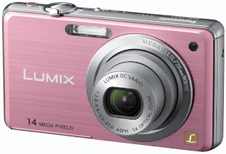
During filming, we often took my digital camera on set to take pictures for our digipack and magazine advert. The camera we used was a Panasonic LUMIX DMC-FS11 Pink Digital Camera. This is a high-resolution digital camera, which produces quality pictures and is equipped with a number of features. The use of the camera contributed to our planning stages of the digipack and magazine advert. The camera automatically detects the different lighting in which the photo is being taken and adjusts LCD brightness for optimal image viewing, which was extremely useful for the different environments in which our photos were taken for our locations.
Photoshop contributed majorly, with the construction of our digipack and magazine advert. We decided that the background of the image was a perfect back-drop creating the theme of our video. To the original image we adjusted the opacities and contrast of the images.
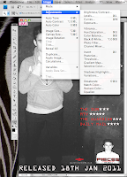
After adjusting the brightness slightly, we used the text tool to insert our font on a new layer. Our main font 'clubland' was chosen from dafont.com. With the use of the free transform tool, we were able to change the angle of our font to add emphasis on certain words. Photoshop is equipped with a huge variety of fonts, which gave us a huge scope of font choices for the different texts used. We would not have been able to do this in most Microsoft programmes, as they do not provide the vital fonts we wanted for our digipack.
This also contributed to planning and research, as we could ask our target audience on their views of the fonts. Photoshop also helped to display the digipack, in a 3 dimensional format on Blogger. Once the image was created I was able to save and upload them as a JPEG in Blogger.
Blogger is an interactive blog and been used for the display and planning of our products. Blogger is like an interactive folder, which contains labels, posts, links, and archives. Blogging allowed us to present all the research and construction of our work. Through Blogger, we were able to display our research of media conventions through the uploading of example music videos. This was a simple process, and simply involved copying and pasting embedding codes. With the use of programmes such as imageloop, I was able to upload slideshows onto my blog to display our work and research. Blogger, also allowed us to include hyperlinks in our work presentation, which was used as part of our research and planning. For my evaluation stages of our project, media technology has been key in presenting our work to be assessed. This has allowed us to present our work in an easy format using digital technology to our full advantage. We have also used the camera to video our target audience where we arrange it like an interview. We were then able to edit our video in final cut, including our song as a backing track and using clips of our video to support what they were saying. We also used the the big projector screen which was a useful way of showing our music video to our target audience.
Question 3
What have you learned from your audience feedback?
The editing does not match the music in parts of the song
The ending needs to be more dramatic
The parts including the moving picture needs to be emphasized
Once our video was completed to its full potential we organised a meeting in our media room where we could show our music video on a big screen. We created questionnaires for them to answer and as soon as the video was shown we received loads of feedback from friends and fellow students impressed with our work.
These people were also mainly our target audience as they were mostly our age with similiar interests and definiately a passion for this music genre. Our most popular piece of feedback was how intense the video is showing how the narrative really grabs them to want to watch more.
We also filmed our target audience giving us feedback to questions we asked. We added our song as a backing track. We also used sections of the music video in the evaluation to use as evidence once the comment has been made.
Here is some further feedback that we acheived in an interview format, producing a feedback video:
Click here for our group video on our audience feedback!
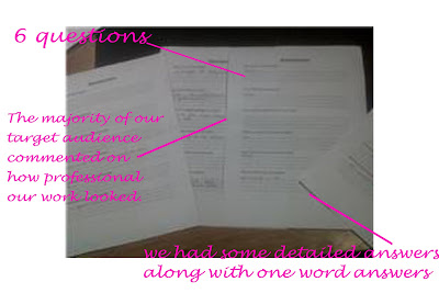
Our target audience first saw our video as a rough cut and gave us feedback then. We knew that we would receive some negative feedback as the video was not completed to the highest standard and we knew it needed improving. During the showing we asked the audience to write any comments on a piece of paper so that we could evaluate after the showing.
Points needed for improvement
The editing does not match the music in parts of the song
The ending needs to be more dramatic
The parts including the moving picture needs to be emphasized
Therefore we realised that we needed some additional footage so that the music correlates with the editing to make the video professional. An audience member stated that 'we should use effective lighting to convey the feeling on the fast tempo of music'. We decided that we would create a non naturalistic scene and use a strobe light to emphasise the music. The scene also included lip syncing which enforced the conventions of a music video.
Once our video was completed to its full potential we organised a meeting in our media room where we could show our music video on a big screen. We created questionnaires for them to answer and as soon as the video was shown we received loads of feedback from friends and fellow students impressed with our work.
These people were also mainly our target audience as they were mostly our age with similiar interests and definiately a passion for this music genre. Our most popular piece of feedback was how intense the video is showing how the narrative really grabs them to want to watch more.
We also filmed our target audience giving us feedback to questions we asked. We added our song as a backing track. We also used sections of the music video in the evaluation to use as evidence once the comment has been made.
Here is some further feedback that we acheived in an interview format, producing a feedback video:
Click here for our group video on our audience feedback!
Subscribe to:
Posts (Atom)