"Digipak is a patented style of compact disc or DVD packaging, and is a registered trademark of AGI Media, a MeadWestvaco, Inc. resource, which acquired the original trademark holder, IMPAC Group, Inc., in 2000. MeadWestvaco licensed the name and designs to manufacturers around the world".
http://en.wikipedia.org/wiki/Digipak
http://en.wikipedia.org/wiki/Digipak


I like the design of Kano's album cover. It is very affective as the background is dark (black and white) with the pattern in coordinating colours. The writing is done so that his name stands out to the audience. The font of the album name and songs on the back is matching but hard to read. This example gives me the idea of the back and front matching and also to include the name and album cover down the spine.


I then went on to look at Plan B's recently released album. I found images of both the album cover and the cd. This album is by the featuring artist of Pieces which means we can relate to the design more. The cover is very dark showing black around the outside and showing the title in an American style theatre lit up which also lights him up in the centre. On the back of the cover the list of songs is also in the same style as the title. The cd has no images just two bold colours; red and cream.
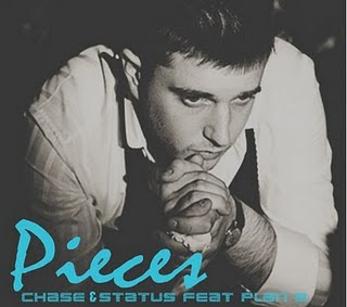
As an idea of what we are aiming for with our digi-pak we created our own using photoshop with the actual artist on it as a rough draft of what pictures we need to get.


We found templates of a digipak which will help as a guidline of shapes and sizes.


After researching these templates we knew what to aim for and decided to create our cd first as we were not going to use images. for the other covers we needed multiple images of our artist so we could choose the right one to put on it.

The album covers above demonstrates the selling point of their album is a close up of the artists face. This is an effective form in targeting their audience as they can easily be recognised. Also the album covers clearly state the name of the artist, catching attention from the audience.

For the front cover of our album we have decided to go for the same idea as Olly Murs' album and have multiple images of our artist in different posing positions. Although we are using ideas from this album the clothing of our artist will not be the same as this but the same as what is worn in our music video. Such as a hoody, jeans and shoes.

No comments:
Post a Comment