Showing posts with label Creation of Ancillary Tasks. Show all posts

Wednesday, 27 April 2011

Original Photos

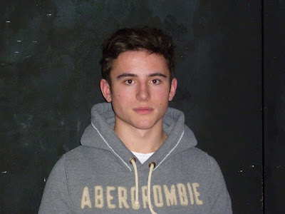
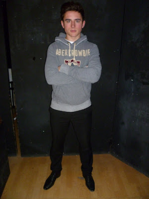
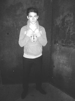
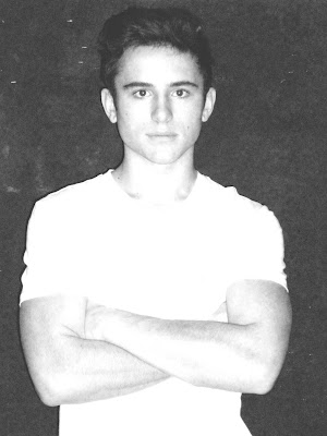
Here are the original photos I took of our artist to create our ancillary tasks. These images are straight off the camera before we edited them.


Wednesday, 16 February 2011

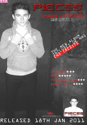
Creating the Magazine Advert

The layout we created for the magazine advert was inspired by an original Plan B magazine advert. Conventions of the magazine adverts we decided to use were:
  • Displaying the name of the album and centralising it at the top of the page.
  • Showing an insert shot of the album cover.
  • Creating a star rating section from newspapers and magazines - the use of well-known players in the media industry to promote the album, also fitting the conventions.
  • A striking focus image.
  • Simple yet effective layout.
  • Legislation information - websites, record label logo and company.
The first stage was to edit the picture that we had chos
en for the advert. Stef decided to use a long shot of the artist:


After I took the photos Stef found this image as an extremely effective shot as she was able to use the background of the image for the magazine advert. ( Stef also edited the image in the same format as the album cover image).

We were aware that too many fonts or a mixture of fonts would create a busy layout and can draw attention away from the main intention of the advert- attracting its target audience. The same font was used in the magazine advert to create a house style. However a font was added to display the information on the advert. The font I decided to use was, 'OCR A STD'. The simple font creates the product to look more professional.

This is the final magazine advertisement which meets the conventions of a magazine advert in the real media industry:


Creating The Digi-Pak

Once the images of our artist were taken , the next stage was to choose the photos we wanted and edit in them in the software we chose Abode Photoshop. To create a house style all pictures would be edited in the same format. Stef desaturated the image and adjusted the exposure and brightness levels to create the effect that was suitable for the product. We decided that the album cover would contain a medium close up of the artist, this is an effective form of the promoting as the audience will relate to the image.

This is the image that we decided to use for the
album cover. The front cover image needs to be eye-catching to the audience:


The next stage was simple as Stef had already allocated a specific font for the album name and artist's names that we all agreed on straight away. The font we decided to use for Pieces and Chase & Status was 'Clubland'. As this emphasised the genre of the music that Chase & Status produce. However to show the rap artist Plan B's genre of music we used the font 'Capture it 2'. The use of colour in the font was inspired by existing digipaks.

From research of real media products we noticed that the back cover of the album all shared the same conventions. A list of titles are all displayed on the back cover, barcode, record label logo and copywright details.

Here is our back cover to the Digipak I believe that the simplicity of the image works well as it allows room for the track names.

From research it was difficult to state which conventions each inside of the album contained as each had different. The inside sleeves I found contained: an image of the band, a list of tracks from the album, a plain colour.

However a majority contained detials about the arists record label, copywright, websites and production information.

Here we placed the CD disc cover ontop of the inside panel to see how it would look when placed inside the Digipak

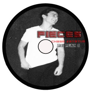
Creating the CD required us to ensure that there was a
clear house style. Therefore we decided to use an image of the artist and display this on the CD. We also included the house style title of the album and name of artists on the CD. Stef finished the cd by using the same effect in which she used in the magazine advertisment by using the background of the image as the CD's background.