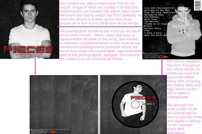
Our coursework is based around the brief to create a music video and 2 ancillary tasks to promote the video and artist. We chose to design a magazine advertisement and a digipak for the Artist we represented in our main task; the video. The artist is the main focus which makes it important that they are portrayed to compliment or emphasise their individual star image.
It is clear to see the continuity of the imagery in the video, advert and digipak in this side by side image.
The dull, dark images of the artist in our ancillary tasks represents his lack of happiness in his relationship and also in life. The lack of colour also represents lack of emotion. These moods have also been shown in the video, digipak and the magazine advertisement.

Throughout all of our products from our video to the inside of our album we tried to maintain a brand identity. A brand identity is to represent our artist's values, services, ideas and personality. A consistent and well-positioned brand can do our advertising, it can generate loyalty from your customers.
Wouldn't you think of brand identity as just a logo?
Maybe that's how it starts out for most companies across all different types of businesses but for us it goes way beyond being ‘just a logo'. Obviously, there can be a logo, a distinctive font and colour scheme, but it's how we choose them and pull them all together that sets us apart.
We aimed to create this brand identity for our artists through all our products. I think we have done this as a team making sure everything relates; we used our target audience for feedback.
When showcasing our final cut to our target audience we asked the audience to fill out a questionnaire. One of the questions asked 'Do you think our ancillary tasks linked to our video?".


